How Color Psychology Can Affect Your Sales and Overall Customer Satisfaction
Color is present in everything we see, and it is a defining factor of the way we react to what we are seeing. This idea of the way our brains react to color is called color psychology1, and it covers the ways that various hues impact human behavior and personality. Color is powerful, evoking emotion and linking to various personal, cultural, and universal meanings. That’s why it is important to consider the general perception of each color when branding your cannabis company and website.
When establishing your brand identity, your color palette should be a high priority. Different colors can mean the difference between someone sticking around on your website and ignoring it altogether. They can separate your business from the rest of the flock. They can appeal to a customer’s eyes just well enough to lead to that next sale.
Here are some things to consider when deciding on your cannabis brand’s color palette:
Consider Your Brand Identity
Who are you? What are you selling? What is the why, aside from making money? What is the kind of customer experience you want for your audience? All of these questions should be answered before you can choose the colors you want to represent your brand. For a cannabis brand, you may be trying to focus on the medical and recreational benefits of cannabis and the experience that goes along with it. It’s a product which can be both useful and enjoyable. Colors like soft, earthy greens and browns are great starting spots.
Consider Your Industry/Competitors
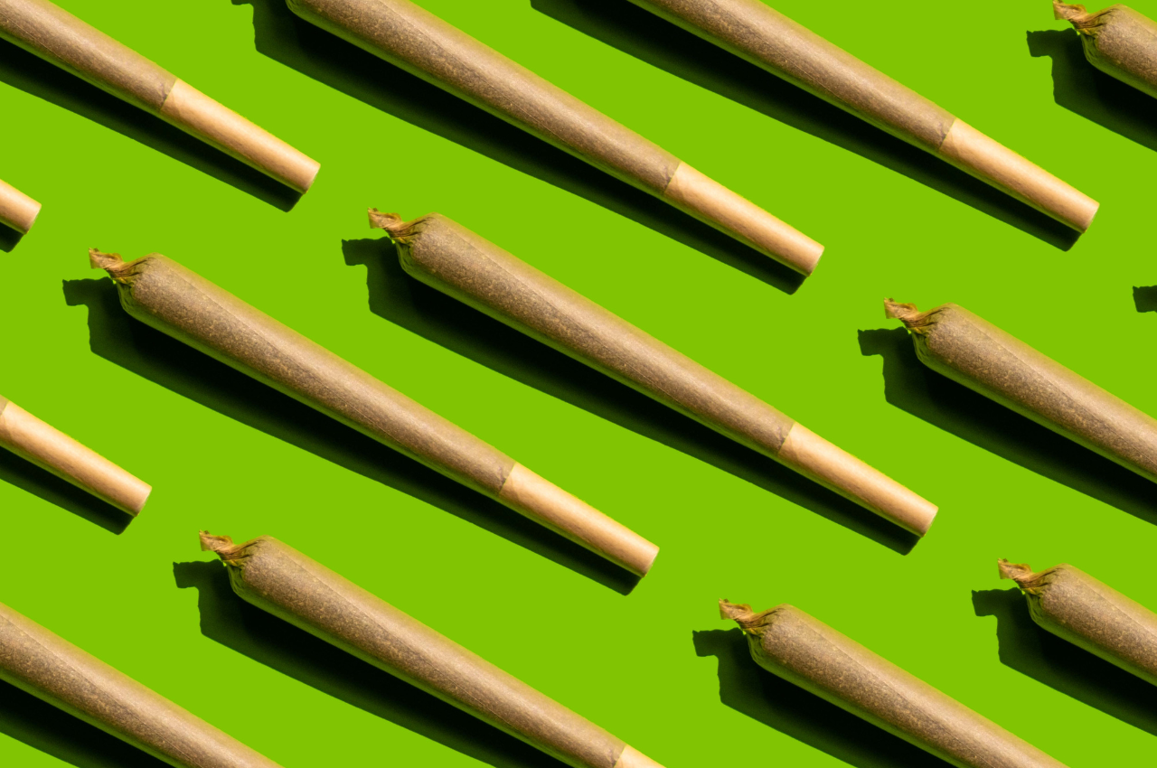
Within what industry does your brand sit? If it’s cannabis, then you know green is going to be pervasive due to its link to cannabis itself. If you are thinking about differentiating yourself using color, think about colors that complement the cannabis experience or even your take on it specifically. Maybe you’re a luxurious brand, or want to appeal to a higher-class cannabis lifestyle, and purple is right for you with its roots in wealth and royalty. Or perhaps you’re a west coast brand who wants to reaffirm that your product is grown in the California sun, in which case yellow will get the job done.
Consider Your Audience
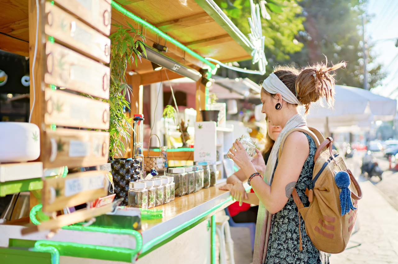
This should go without saying, but the audience you intend to keep and grow should be top of mind. They are the ones on whom you are effectively practicing your color psychology test. If your customers are typically regular cannabis users, looking for quality products that will fit discreetly into their busy lives, then blue may be a good choice. Blue tends to represent trust, strength, and reliability when tied to brands. Don’t feel that, just because you are a cannabis company, you need to overuse the color green.
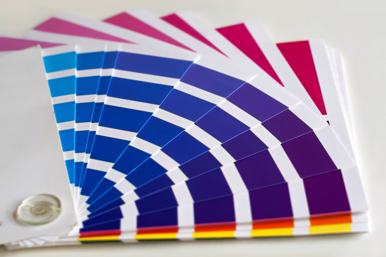
Dive into Different Shades
Plenty of brands use the standard shades of colors that sit right in the middle between warm and cool. Don’t be afraid to branch out and play with color mixing that can lend you shades far more unique and far more elaborative than the usual. Maybe you’re a cannabis company that takes heritage from the Netherlands and wants to make Amsterdam’s cannabis scene a focal point of your business story—a bright orange often associated with the country would be an outspoken, eye-catching option.
Complimentary Colors
Often, your brand won’t just have one color. This is especially true when building your website, which will need multiple colors to give it life and keep it from being one-toned. Once you’ve figured out your primary color, look for colors to compliment it nicely, and sprinkle them around your website in different functions.
Colors are a useful tool for tailoring the customer experience on your cannabis brand’s website, and color psychology should be kept in mind when determining which colors to utilize. Remember what natural images and emotions people generally associate with each color. For example: Red is exciting and active, green is natural and healing, and gray is neutral and technological. Build your website with the right colors for your brand, and consumers will begin to associate them with your products. This can be incredibly effective for keeping you front of mind, making sure customers continue coming back for the products and experience they know and trust.
Need to find the right color scheme for your brand’s new website? Find guidance amongst our branding and web design experts here at Herban Creative. Contact our team today!